The biggest question in ecommerce A/B testing is not “how.”
It’s not even “what.”
It’s “why not?”
A survey by ConversionXL of 722 participants shows that 43% run fewer than five A/B tests per month![*]
They know experiments can improve their business, but they don’t act.
Why?
Because they don’t know how!
Regular A/B testing helps you to iterate site changes and give you a competitive advantage!
That’s what this guide is for: to help ecommerce businesses understand how to run an A/B test and give them inspiration for different A/B testing ideas.
%(tableofcontents)
All A/B Testing Ideas In One Table
A/B testing is a data-based approach to ensure we understand the impact of the changes we make to our site, ads, or emails.
At a very high level, A/B testing is done in four steps:
-
Define your hypothesis
-
Design the experiment (sample size, impacting factors, when is the difference meaningful, run time, participants, goal)
-
Gather data
-
Analyze data
When you begin with A/B testing, your list of ideas gets long quickly; after a while, that momentum to test and add ideas gets lost. That’s why I collected the most important ideas in a table, to inspire you and keep your momentum going.
The table is sorted by page type because not every page is equal. The homepage, for example, receives significant but unqualified traffic: it’s not yet clear what the user wants to accomplish. Did she come to the homepage because she heard about the store in an ad, or because she wants to search for a product in your shop?
The deeper we move into the site hierarchy (homepage at the top, product pages at the bottom), the more refined our understanding of the user's intent becomes. On the homepage, it’s very fuzzy, but on a product page, we know the user is considering buying the product. Once she visits there, our questions are “does she understand the value?” and “is this the right product for her?”.
We need to look at different success metrics and segments when testing different pages and channels. The success metrics are simply the numbers you look at to understand whether the control or variation of your experiment performed better. The segments are specific attributes within that experiment that can give you deeper insights about your A/B test.
When you perform A/B tests for specific segments, you're much more likely to find a winner because you have less noise in your target audience.
| Metric | Segments | |
| Homepage |
|
|
| Category page |
|
|
| Product page |
|
|
| Search page |
|
n/a |
|
|
|
| SEO |
|
n/a |
| Ads |
|
|
Testing different segments is important because not all users behave the same. There are differences depending on what channel they came through or what device they use. Your goal is to understand the impact of different channels, devices, and user profiles on your revenue to make the best business decisions possible.
With a better understanding of the numbers and segments to test, we can move on to actual experiments.
| Elements/ page types |
Homepage | Category page | Product page | Search page |
| Page layout | One product offer at top of the page | Filter position and number | Product description | Mosaic layout vs. list |
| Personalization for logged in or repeat customers | Show several products vs. one product at the top | More info above the fold vs. less | More vs. fewer details | |
| Best-sellers vs. promotions | Open vs. closed spec accordion | |||
| Full vs. lean | ||||
| Navigation | Drop down vs. static | Sidebar nav. | Navigation vs. no navigation | Filters to narrow search down |
| Search box placement & size | Big vs. small breadcrumb nav. | |||
| Super lean (fold-out) | Highlight best-sellers | |||
| Category order | ||||
| Show notifications in nav. | ||||
| Headlines | Description of what store offers vs. no description | Small vs. big | Color set apart from rest of content vs. equal color | Headlines of different sections vs. none |
| Big vs. small section headlines | Color | |||
| Copy | Highlighting product value vs. description | Copy at top vs. bottom of page | Descriptive copy vs. none | n/a |
| Copy in promotion | Above specs vs. below | |||
| CTAs | Color (contrast vs. none) | Color (contrast vs. none) | Urgency (countdown) | Email signup popup |
| Email signup popup | Email signup popup | Email signup popup | ||
| Sales marks | Written out vs. symbol | |||
| Above vs. below the fold | ||||
| Position | ||||
| Images | Larger + fewer or smaller + more images | Product callouts (focus on 1-5 products at top of category page) | Freestanding product hero vs. crowded | Product images vs. text only |
| Amount of results | Image gallery | |||
| Image sizes | Videos vs. images | |||
| 360 view of product | ||||
| Product only vs. product in use | ||||
| Product hero size | ||||
| Price | Prices vs. no prices | Prices vs. no prices | Price size, color, placement | Prices vs. no prices |
| Size and color or price | Price with shipping vs. without | |||
| Zeros vs. no zeros | ||||
| Promotions/ offers |
Promotions at the top vs. bottom | Promotions vs. none | Promotions vs. none | Highlighting a price reduction |
| First-time visitor promotion | ||||
| Seasonal promotion | ||||
| Highlighting sales in your navigation | ||||
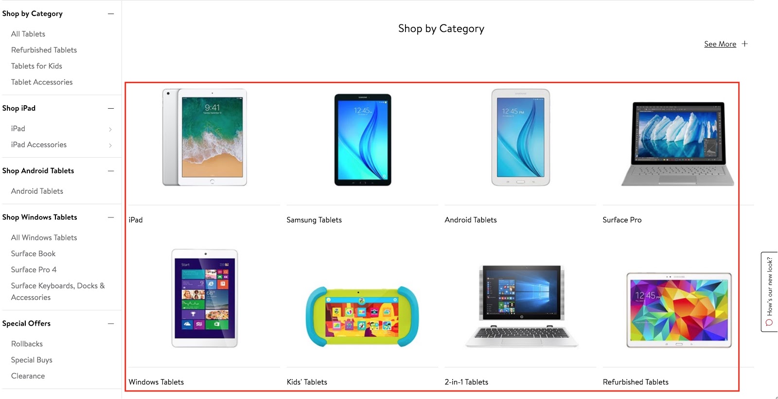
| Content | Personalized products | Default type of product sorting (price, relevance, new to old, top-rated) | FAQ | Product recommendations in search box |
| Specific products vs. categories | Products other users bought in this category | Ask question right on the page | Search suggestions (“other people also searched”) | |
| Social media feed | Descriptions/details/specs (how much info below a product image is enough to make user click?) | Promotional offer vs. no offer | Specs in list versus images | |
| Show blog articles | Brands vs. categories | Number of related products | ||
| Hero image vs. video | Subcategories | Instagram/social feed | ||
| Related categories | Complementary products | |||
| Promoting guides and shopping advice | Specs in list or image | |||
| Showing only subcategories vs. subcategories + products | ||||
| Social proof | Testimonials | n/a | Reviews + ratings (placement, amount, highlighting good reviews, testimonials) | Product recommendations on search pages |
| Images of people using/wearing product(s) | Person vs. no person in image showing how product is used/ worn |
You might have a question or two about the table, so I want to zoom in a bit on each page type and provide a few examples. We’ll start with the homepage, then move on to category pages, product pages, and search pages. I’ll also cover some often-forgotten areas for testing outside of that.
Let’s go!
Homepage A/B Testing Ideas
As I mentioned before, the homepage is one of the most important pages for traffic, but not for revenue. Your primary goal here is to convert first-time visitors into leads, for example by getting them to sign up for your newsletter. For existing customers, the goal is to provide a personalized experience that leads them to product and category pages, or promotions.
Idea #1: Making the homepage leaner
User experience often improves when making a page leaner — not fuller. One mistake that’s often made on the homepage is trying to do 100 things at once. Instead, think about how you can narrow the experience down to one, maybe two goals.
The Shopify store Faucet Face below looks very noisy. There are too many elements above the fold. I would test a version that has just one element above the fold, maybe a product hero image, and push the rest further down.
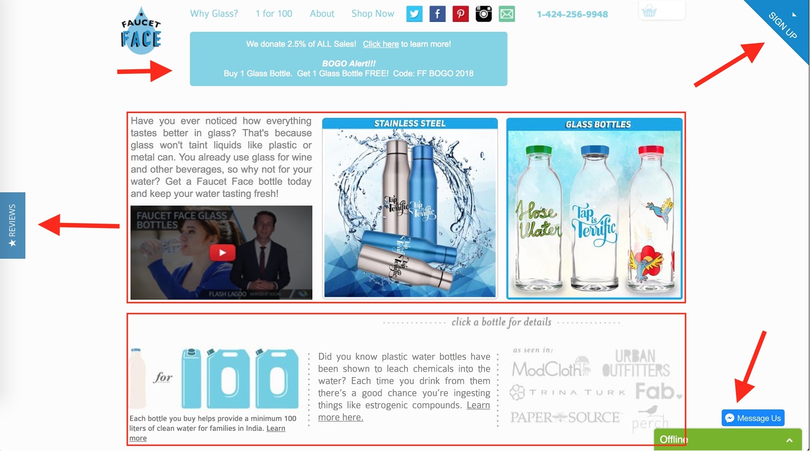
I would also test taking away the signup button, review button, and the chat window.
An extreme example of such a homepage is the Shopify store Triangl, which only has a few elements on the site but immediately shows what the product is.

Idea #2: First-time visitor promotion
For first-time visitors, it might be valuable to make an offer right away — depending on the source of their visit. They might have read an article about your product and clicked on a link, which indicates a certain prequalification. Or they heard about your store, searched for it on Google and want to check it out. Both use cases come with different implications, which is why testing an immediate offer is interesting.
Idea #3: Seasonal promotion
Ecommerce provides many opportunities for seasonal promotions, from Christmas to Valentine’s Day and more. A viable experiment could look at the right place for a seasonal holiday promotion, whether as a popup or a fixed part of the homepage.
Idea #4: Hamburger menu versus full navigation
In a mobile world, most navigation comes in a hamburger menu format. It’s interesting to test that format for desktop as well since it’s becoming such a standard. I would measure the impact on clicks and pages per visit in such an experiment, and also test using the work “Menu” instead of the hamburger icon.
Idea #5: Highlighting sales in your navigation
Highlighting an important sales offer in your site navigation has the benefit that it’s visible on every page and gets a ton of attention.
Besides SALE, some other categories you can test highlighting in your navigation are best-sellers, top-rated, or seasonal.
Idea #6: Showing notifications in your navigation
Notifications are everywhere these days. Sometimes they’re annoying; sometimes they’re helpful. On your store, you can only test how users react to them. Making them aware of a current promotion, of an item they saved in their cart or of an important update about the company are legit notifications you can test with clicks and conversions.
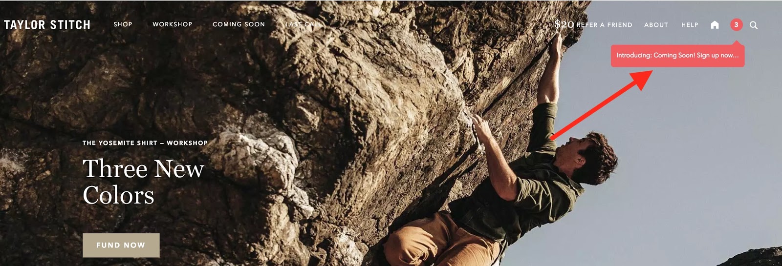
Shopify store Taylor Stitch uses a small notification on the top right of their homepage to get more visitors to sign up for their email newsletter.
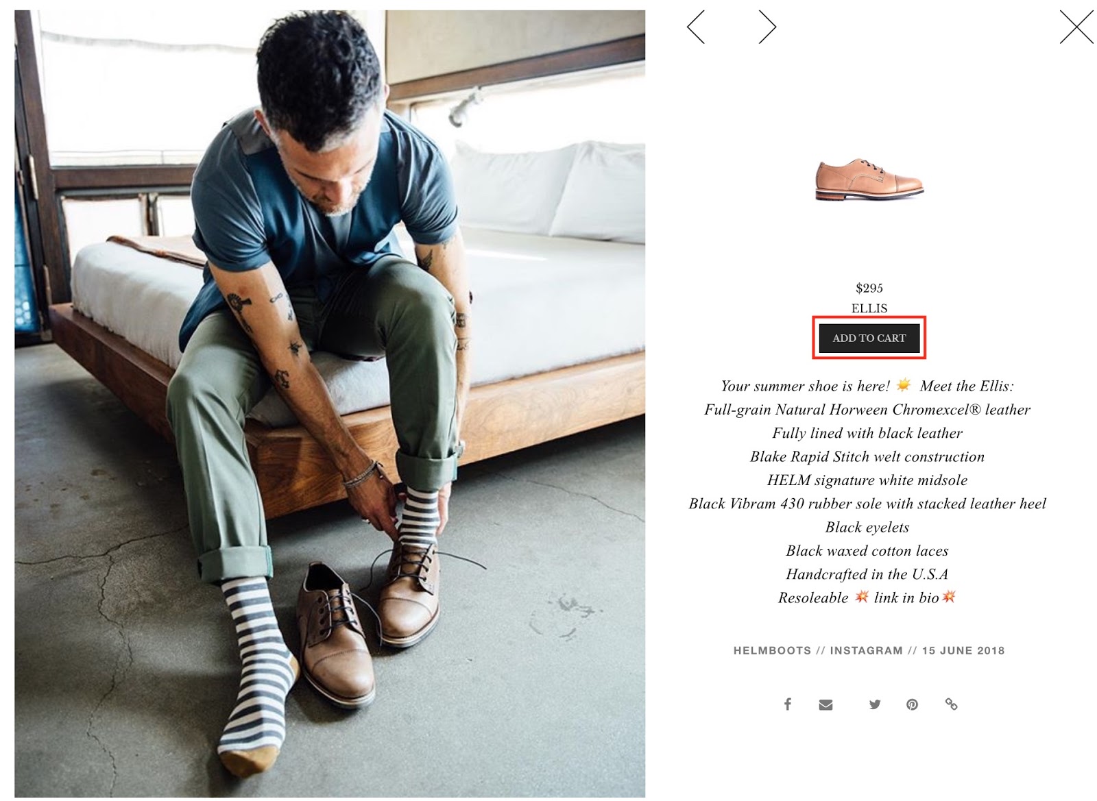
Idea #7: Shopping on Instagram
Instagram provides a shopping functionality that lets users buy the product right from their feed. Here’s what it looks like on HELM Boots Shopify store:
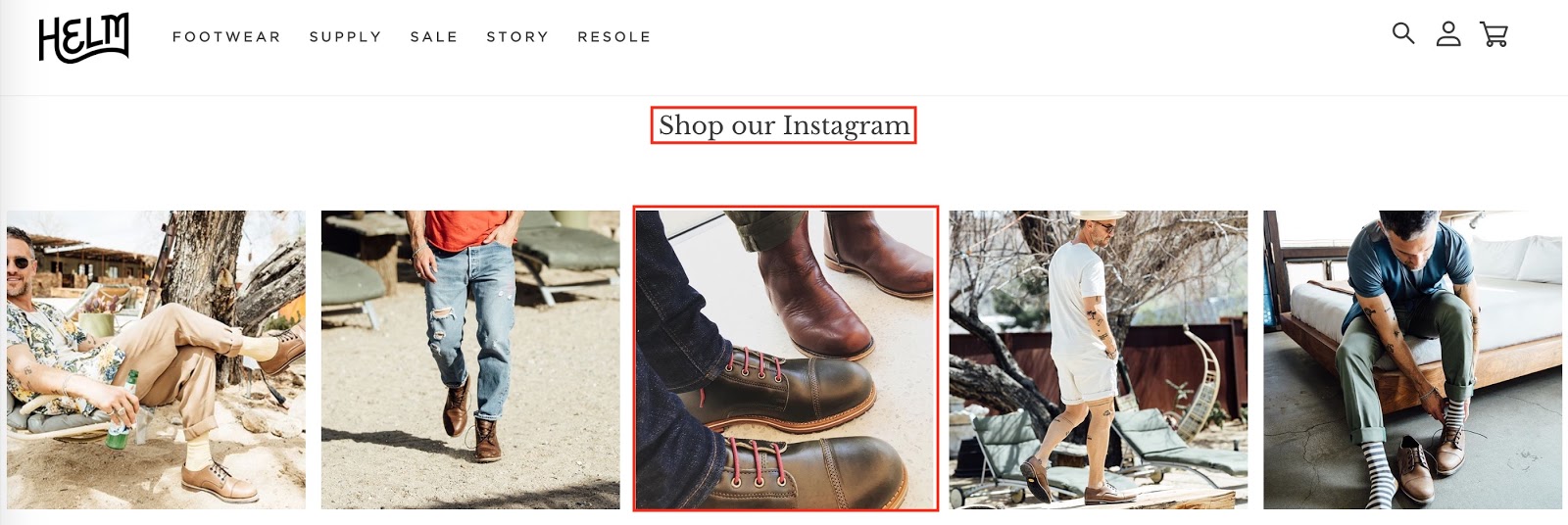
Try adding the feed to your homepage and test if users are more likely to convert from that feed (or at least follow you on Instagram). The idea is that users are more likely to order through an Instagram picture because they see the product from a different angle.
Category Page A/B Testing Ideas
A category page is not only an important hub for search engines (in terms of SEO) but also for users. It’s a page for the middle of the funnel, when users consider buying something but don’t know which product yet. Browsing and exploring is a vital part of shopping. A buyer’s decision is more refined, based on whether she browses a category or subcategory page.
For category page experiments, it makes sense to measure:
-
Clicks
-
Revenue
-
Conversions
-
Bounce rate
-
Pages per visit
-
Dwell time
Idea #8: Highlight one product at the top
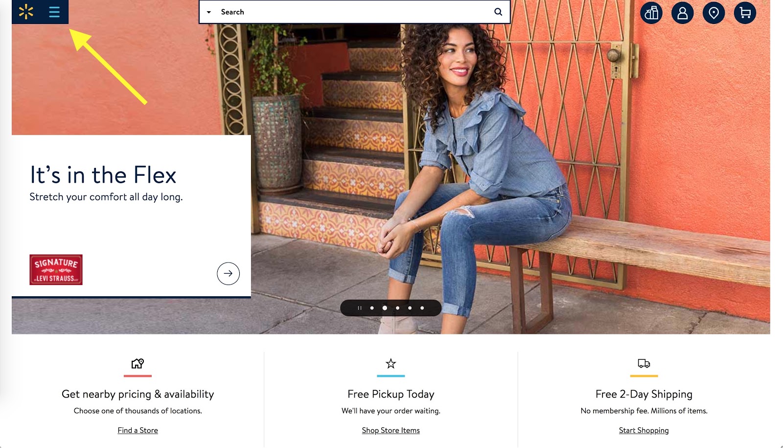
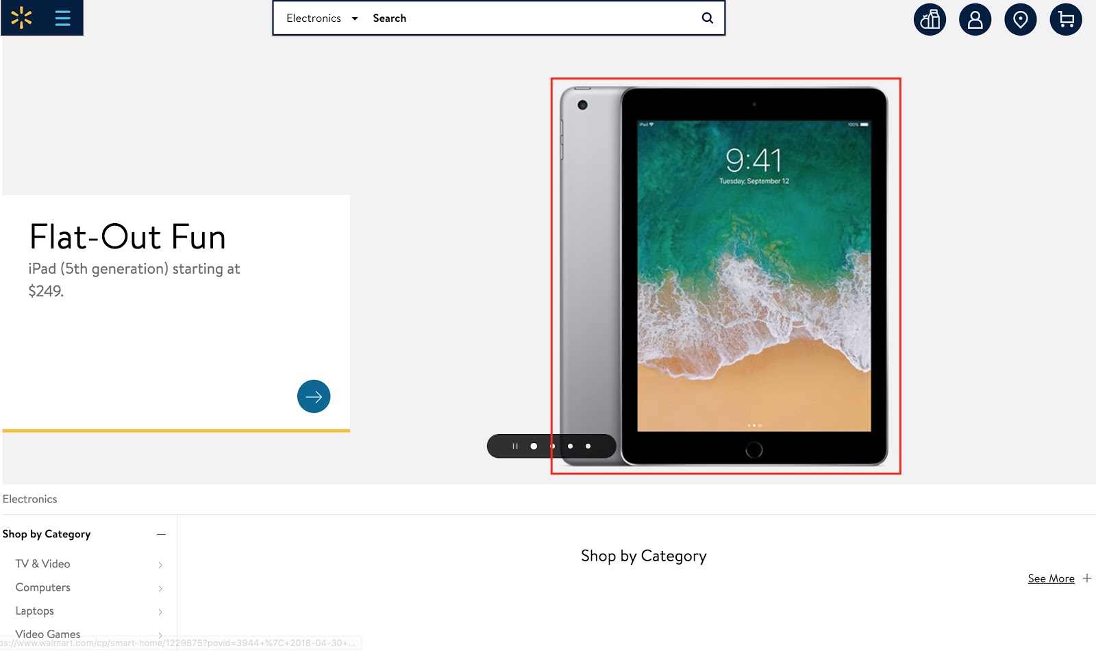
For category and subcategory pages, it makes sense to test highlighting the best-seller or best-rated product of that category at the top. On the category page for electronics on walmart.com, you can see an iPad highlighted, for example. Walmart has a slider with 4-5 products in the header, probably depending on offers, season, and other factors.
Idea #9: Lean category page
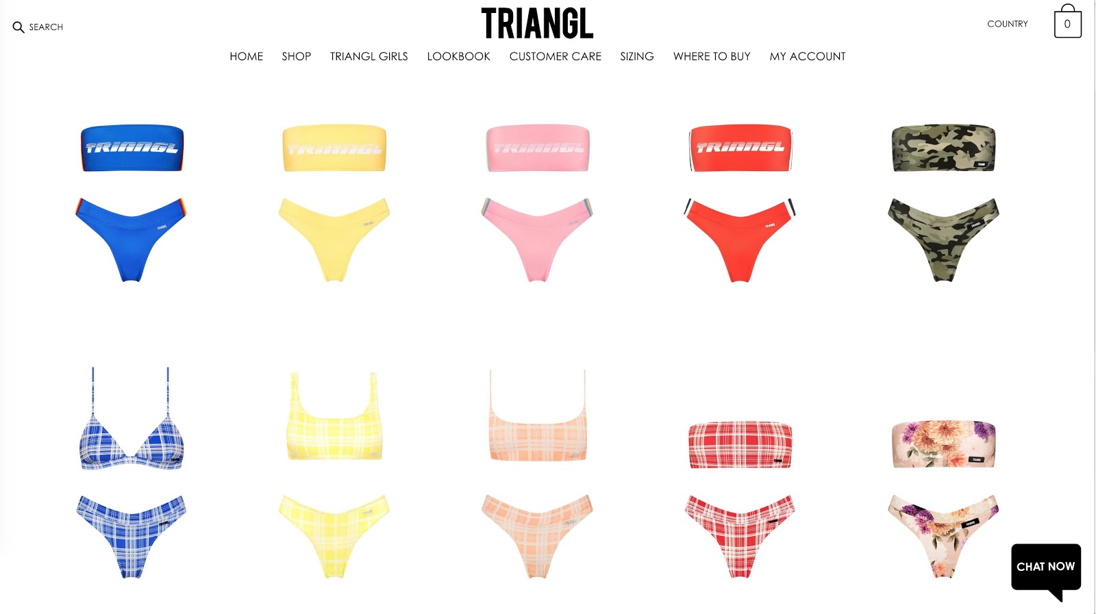
The idea of a lean page, one without many elements and mostly visuals, can be applied to category pages. You need to find the right balance between [x and y], but you can go as far as showing product images only and providing more details when hovering over the image. Here’s how Shopify store Triangl does it:
Idea #10: Sales marked on the category page
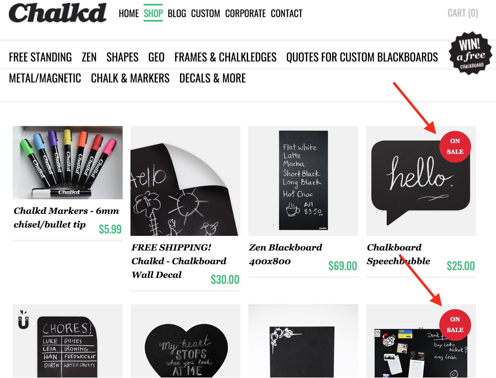
Indicating a sale on a category page helps visitors to make a product decision. The idea is to turn a browsing behavior into a specific buying intent. Here’s how Shopify store Chalkd does it:
Idea #11: Promoting guides and shopping advice
Given that category and subcategory pages are used for researching, it makes sense to experiment with guidance and help specific to that category. Test and measure the impact of adding a buyer’s guide or offer shopping advice from an expert.
Idea #12: Showing only subcategories vs. subcategories and products
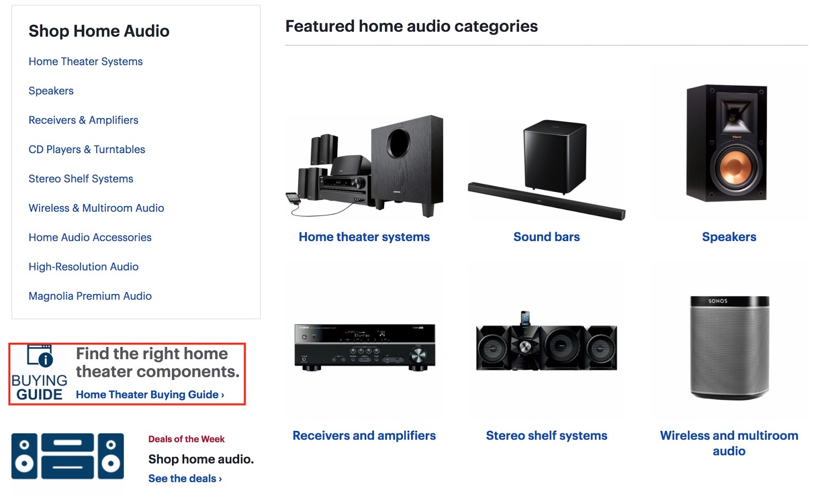
Even though the main job of category pages is to narrow down the user’s search, for example from “audio” to “speakers,” it’s interesting to test showing selected products on them as well. A good indicator of success would be clicks and conversions for such an experiment.
Walmart shows only subcategories at the top of its category pages, for example, and hints at more products below with a product feed.
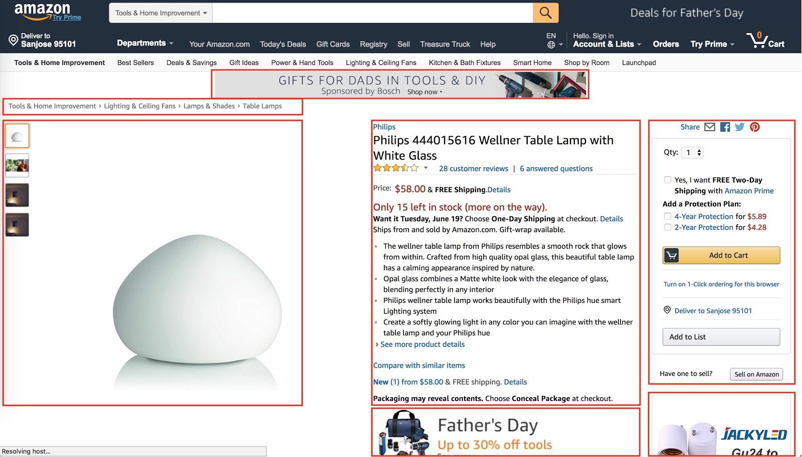
Product Page A/B Testing Ideas
Product pages are often the core of experimentation — the money is made here! Not only are product pages the center of conversion, but it’s also the template with the most pages on an ecommerce site. Hence, optimization of product pages often has the biggest impact.
Based on that position, product page experiments should be measured by the following metrics:
-
Revenue
-
Conversions
-
Average order size
Idea #13: Full versus lean product page
Amazon’s product page is full of information, which leads to the assumption that more information leads to better conversion rates. So, what do we do with assumptions? Test!
Brainstorm what information you can show for your product and experiment with it. Don’t test 100% of your ideas with the current version. Select a few and iterate on the optimal product page instead.
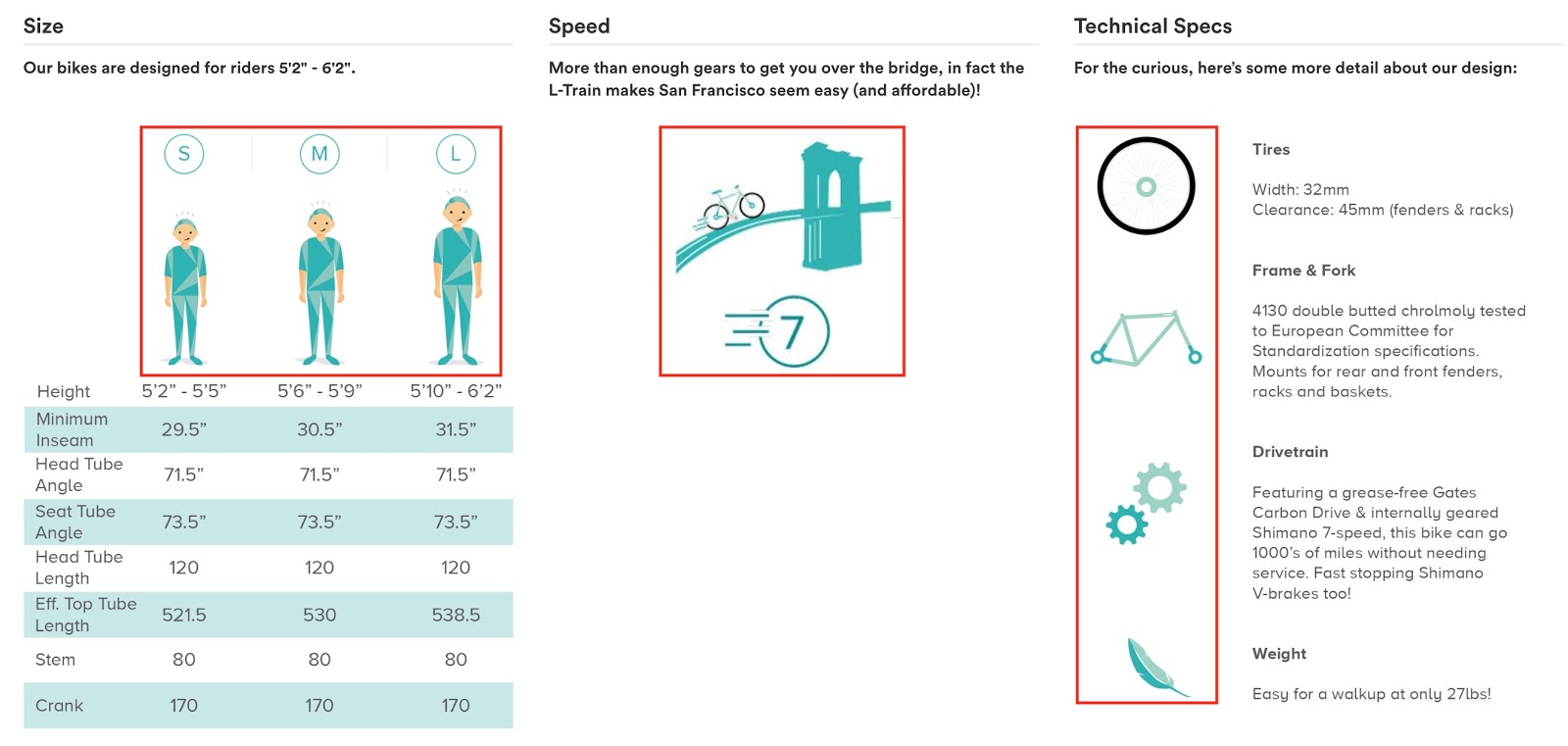
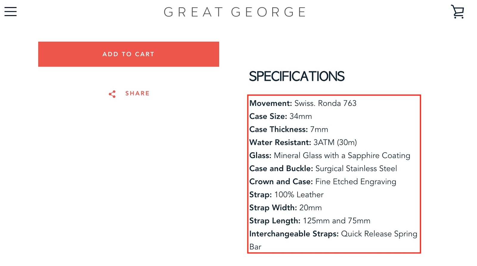
Idea #14: Specs in list versus images
Another interesting experiment is the format you use to communicate product specifications and descriptions.
One approach is images that visualize product attributes like size, quality, material, and more. Here’s how Shopify store Brilliant Bicycle Co. does it:
In some cases, a simple list might be enough, like Shopify store Great George Watches uses:
There is no right or wrong way, so you have to experiment with it.
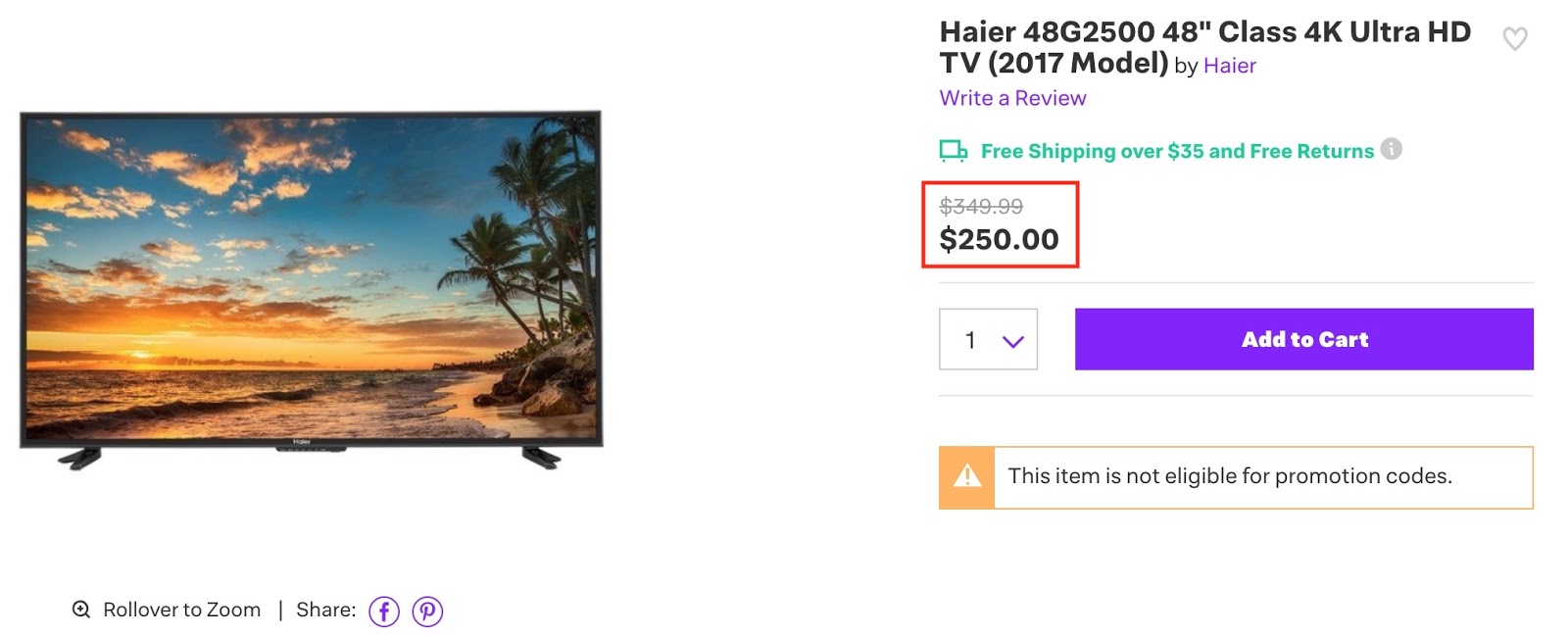
Idea #15: Highlighting a price reduction
Price reductions are one of the main drivers for buyers, and it’s worth experimenting with different ways to display that.
Idea #16: Showing the product versus how it’s used
Of course, you have to show your product. But does it matter whether users see the product in action versus just on a white/black background? An experiment reveals the answer.
What is more attractive: Seeing just the product?

Or seeing it in action?
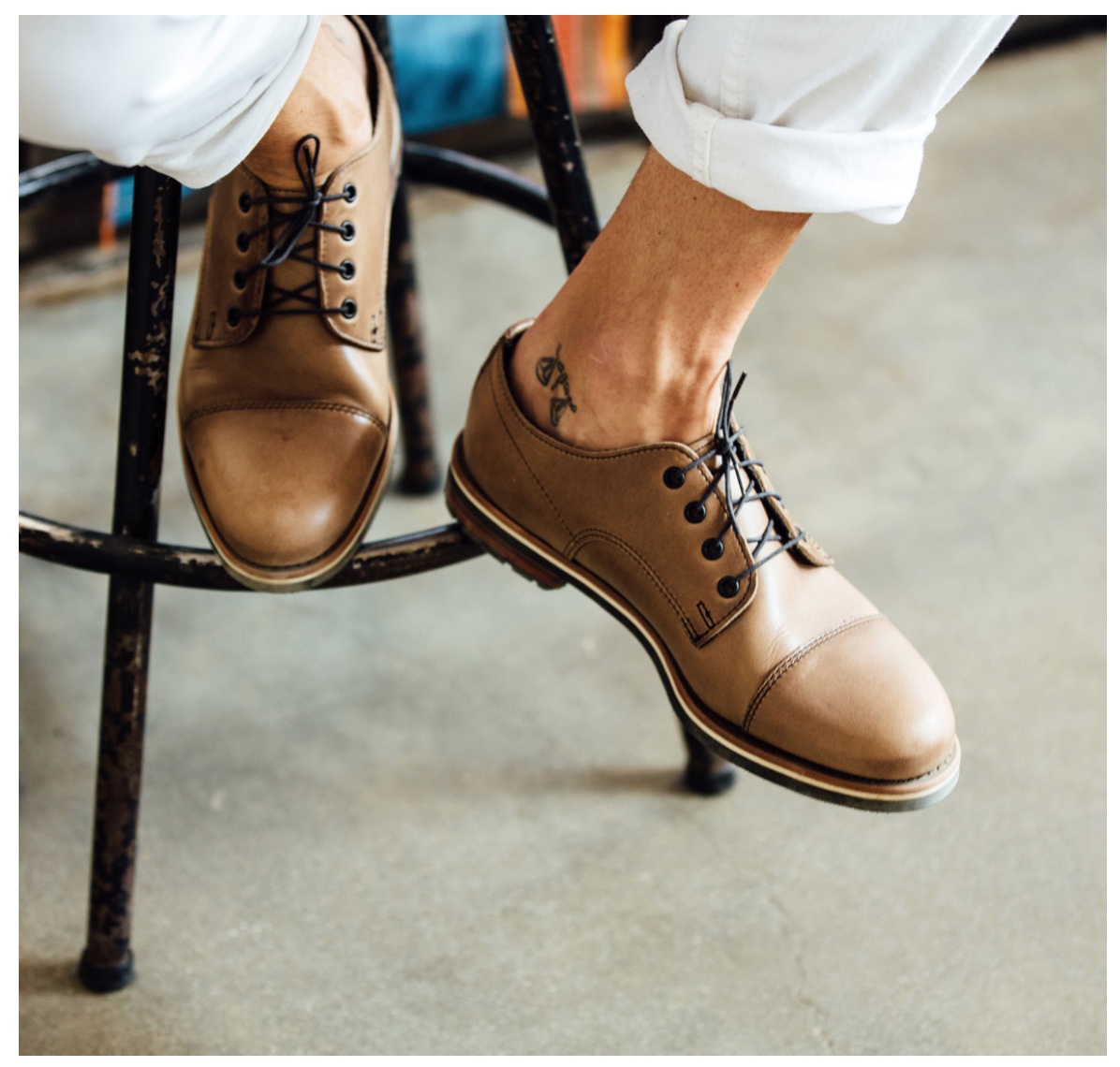
Test it!
Search Page A/B Testing Ideas
The bulk of your experimentation efforts should happen on the pages that make you money. But you shouldn’t completely forget the pages and channels that bring traffic to your conversion pages and the pages handling the transaction.
One essential part of every shop is search. Search pages have only one purpose: to bring a user to another page. Hence, it’s smart to test different layouts, filter navigation, and recommendations.
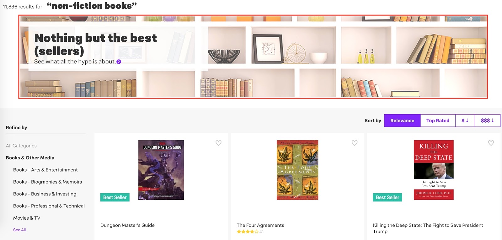
Idea #17: Product recommendations on search pages
Recommendations in search pages can be tricky from a technical standpoint, but if manageable they can have an interesting impact on revenue. Users have a goal when they search, so from this point on it’s about whether you can help them find it.
Jet.com shows best-seller recommendations on top of its search results for “non-fiction books.”
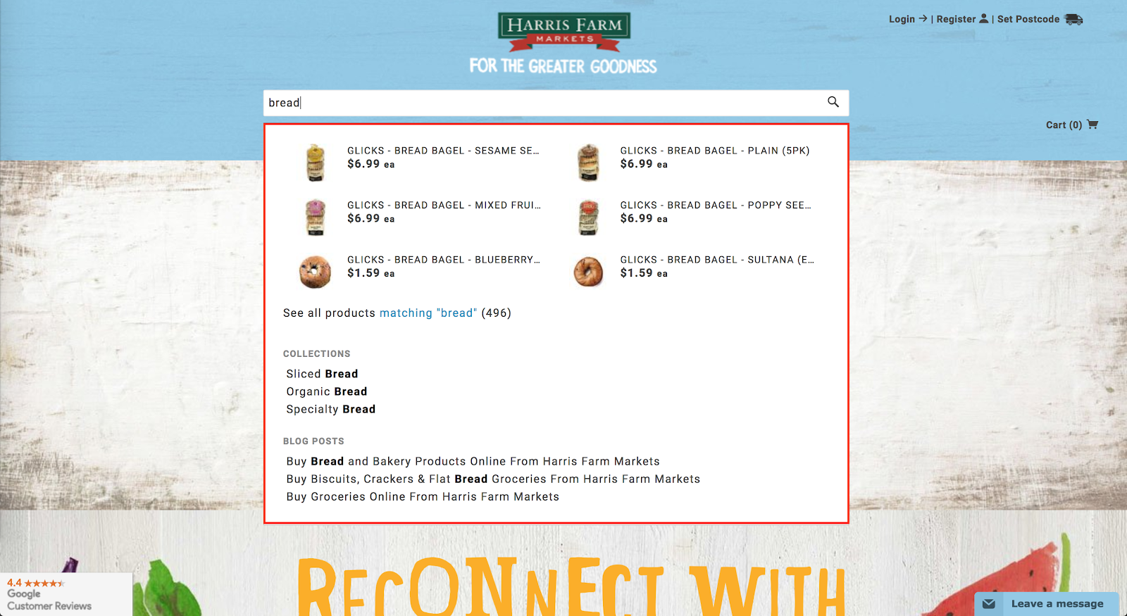
Idea #18: Show recommendations while users search
Sometimes users aren’t sure how to formulate a search. Try helping them as they are entering their query. Providing product recommendations, suitable categories and even blog articles in the search field is something you should test.
Here’s how Shopify store Harris Farm Markets does it to help visitors quickly find groceries they want to buy:
Idea #19: Mosaic versus list view
Making it as easy as possible for users to find the right product is also a matter of user experience. In some cases, a list view is better, in other cases a grid view. It depends on your product and how broad the search is. The narrower, the more sense it makes to use a list view to provide more details about the product. One way to test is to compare user engagement for a mosaic view versus a list view.
Here is what the mosaic view looks like:
Here is what the list view looks like:
You should provide the option to use both, then once you have enough A/B test data, you can show the winning version.
Checkout Page A/B Testing Ideas
Of course, you also have to test downstream from the conversion page: the checkout process. There is nothing worse for an ecommerce store than losing customers in the checkout process.
Idea #20: Offer at checkout
When users check out, they are already very invested in the decision to buy this product from you. That’s a good opportunity to have them sign up for a membership or subscription.
It’s important to find the right balance here: how useful is it for first-time customers to sign up versus repeat customers? What is the impact of order size on the likelihood to sign up?
Idea #21: Recommendations in shopping cart
When users add an item to their shopping cart, it can make sense to show them items other users bought as well. Often, shoppers have similar interests, and this is a way to capitalize on that.
Idea #22: One-page versus multi-page checkout
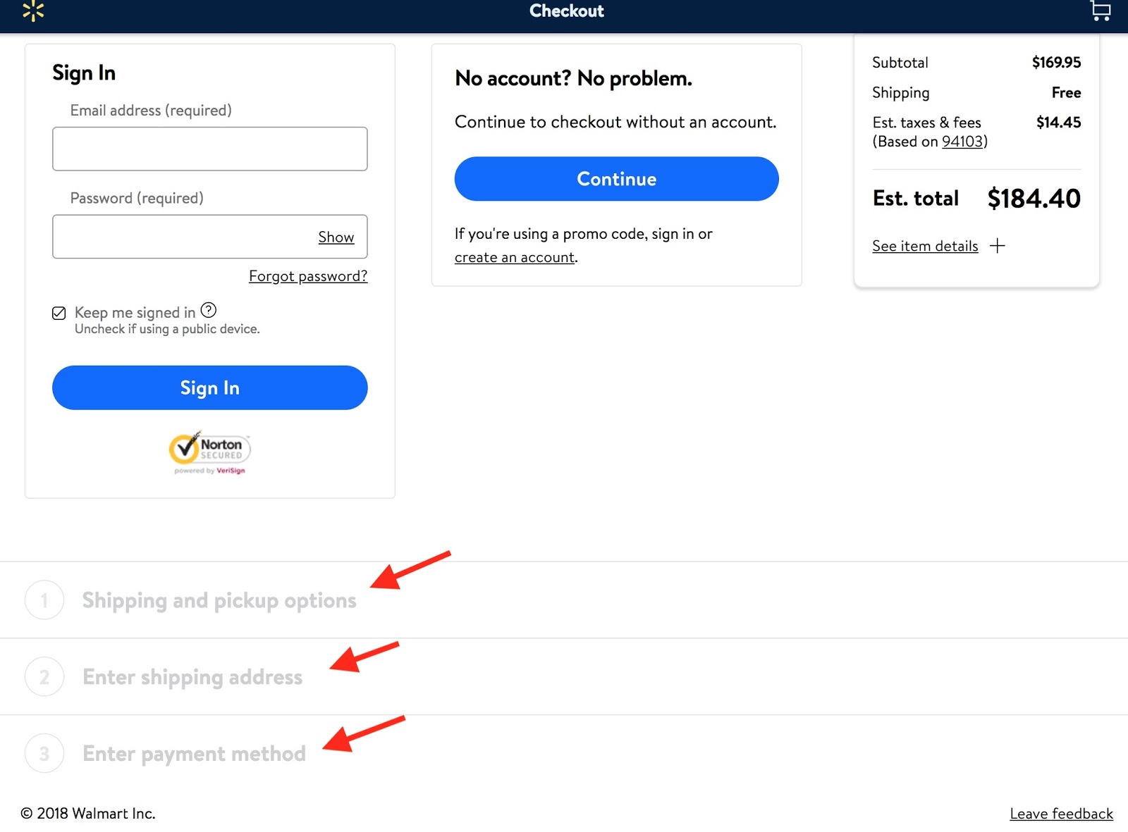
Providing checkout on a single page versus multiple pages can have a big impact on shopping cart abandonments. You have to find out what makes it as easy as possible for your customers while not being confusing at the same time. On the screenshot below, you can see how Walmart creates a convenient checkout flow on one page.
Of course, you can test more than just pages. You can also test marketing channels, such as SEO, email, and ads!
Marketing Channel A/B Testing Ideas
Idea #23: Ad testing
Instead of testing content or layout when the user gets to your site, why not test how to get her to the site in the first place? That’s what ad A/B testing is for, and luckily most ad platforms make it very easy to design such experiments.
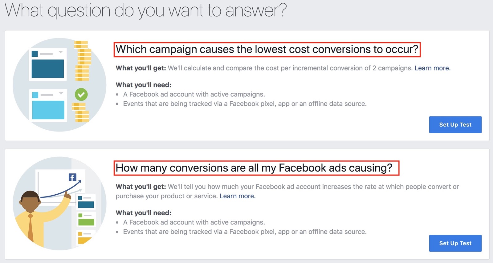
Facebook’s ad manager comes with built-in A/B testing functionality. To set it up, all you need to do is add the Facebook pixel to your site. You should have at least 100 conversions per test to get statistically valid results. So if you are just starting out and have five conversions per week, it might be a bit too early to experiment.
Knowing how much a conversion costs you, for example from previous campaigns, can also help you estimate the budget you need for ad testing. Say you have to pay $5 on average for a conversion and want to run an experiment with two variations. With 100 conversions for statistically relevant results, you now know you’ll need to spend roughly $5 x 100 x 2 = $1,000.
You can test ad copy, images, calls-to-action, or showing the same ad to different audiences. Facebook will tell you not only how many clicks each ad got, but also how many conversions!
There is much to be learned from testing ad variations:
-
What message (copy) your audience resonates more with
-
What images catch their attention
-
What audience your product is most appealing to
-
etc.
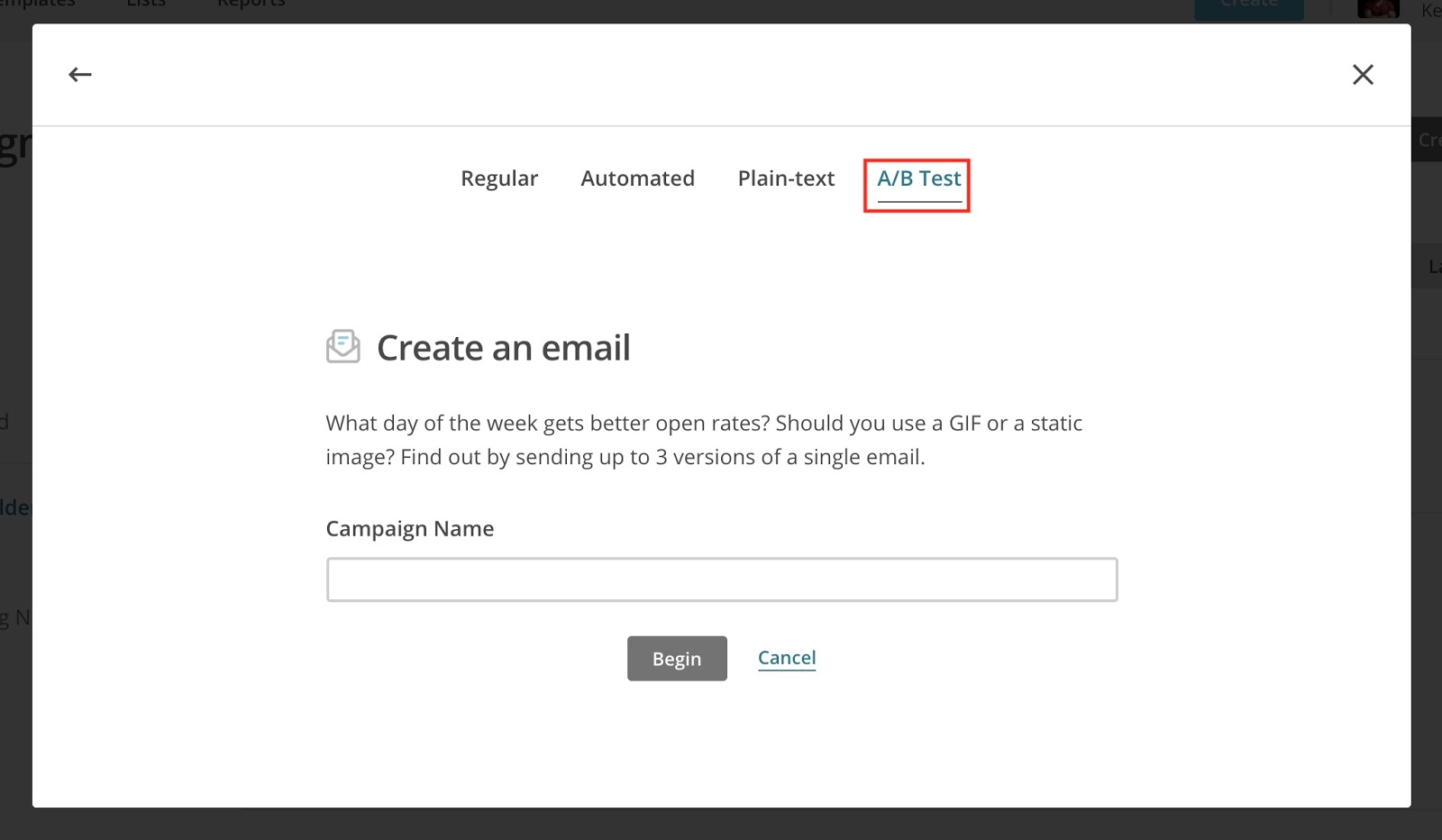
Idea #24: Email testing
Email testing brings similar insights as ad testing: understanding your audience better and what offers make them convert. But email goes a step further: what subject line makes a user open an email? You can test subject lines to see what messages get more of your subscribers to open them.
You should test different email formats:
-
Welcome Email
-
Promotion
-
Reminder/reactivation
-
Cart abandonment
-
Etc.
Each of these has a different purpose and context in which it is relevant. Hence, email testing should be a staple in your experimentation culture.
Idea #25: SEO testing
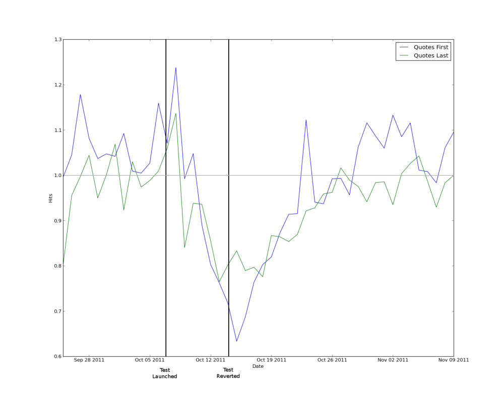
SEO follows a slightly different framework, as it’s more of a quasi-experiment with bots than users. However, that doesn’t make it less useful to us. Companies like Thumbtack, Pinterest, Etsy, and others proved that when you have enough traffic and lots of templatized pages — which ecommerce stores have — you can do SEO testing. The image below shows an SEO experiment from Thumbtack, where three different title tag variations were tested.
Thumbtack put a few thousand pages into each title tag bucket, then launched the test on October 7. On October 14 they could see that the alternate variations had underperformed the baseline title tag by 20-30%. So they reverted the titles back to the original title tag, and the traffic returned to a normal level.
This process is very similar to other forms of testing: you take a group of pages with the same template, change one variable and see how their traffic, CTR, or rankings diverge. Strictly speaking, SEO testing is a quasi-experiment because it lacks the randomization factor. You know exactly which pages get which treatment (changes made), as opposed to actual A/B testing, in which a user randomly sees the control or variation page. The randomization is important because it doesn’t favor a specific user or group. It’s okay for SEO, though, because the user is a machine and therefore shouldn’t be susceptible to bias.
A/B Testing Mistakes
Many costly mistakes in A/B testing can be avoided when you know what to pay attention to. Starting out isn’t easy but it’s better than not starting with experimentation at all. Some mistakes have to be made, but I want to give you a list of tips that should prevent you from making the ones costing the most money:
-
Start experimenting with the page that brings the most expensive traffic (highest CPA/CPC): “start where the money is.”
-
Experiments must be falsifiable, meaning you need to be able to prove that doing the opposite leads to worse results.
-
Somebody in the company needs to be responsible for testing, otherwise it tends to fall off the table. Buying the software and spending time to develop tests costs you money with no return if you don't actually do the testing.
-
Test one change at a time. The more variables you change, the lower your confidence in the results.
-
If it takes too long to build an experiment, e.g., because of the time it takes to design or code a variant, it’s probably not a good idea. It usually means that the changes are too complicated to understand and roll out.
-
Perform the same experiment on mobile and desktop. The results can be completely different.
-
Hold regular brainstorming meetings to fill your testing idea backlog.
-
Don’t focus too much on button colors, test hero shots and big page elements instead.
Three Key Takeaways
Here are the three key takeaways:
-
Test designs and success metrics depend on what page type you test, like homepage versus product page.
-
Test pages and marketing channels: Email, ad campaigns, and SEO.
-
Get started, keep your momentum, and create a routine of testing.
To get a short step-by-step guide on how to get started A/B testing for your ecommerce business, grab my ecommerce A/B testing guide below.


Add A Comment
VIEW THE COMMENTS