How To Format Your Blog Posts So People Are Actually Reading

Last Updated Jul 28, 2020
Last Updated Jul 28, 2020
In content marketing, your blog post format plays a critical role.
You can write the highest-quality piece of content in your niche and industry, but if your formatting is off and hard to navigate, you’ll have a hard time keeping readers engaged.
Today, I’m going to show you the A to Z of how to format your blog posts to get your readers engaged and to convert at the end of their sessions.
Let’s go!
Your blog layout is the first step in formatting your posts. Often, it is constrained by the WordPress theme or Shopify theme you’re using.
Here are a few key tips when designing your layout.
The first thing your readers see is how easy your blog is to read and navigate. The number of columns you use plays an important role; it’s best to limit your blog to two columns.
A single-column blog makes it easy to read, and it's the easiest format to make responsive.
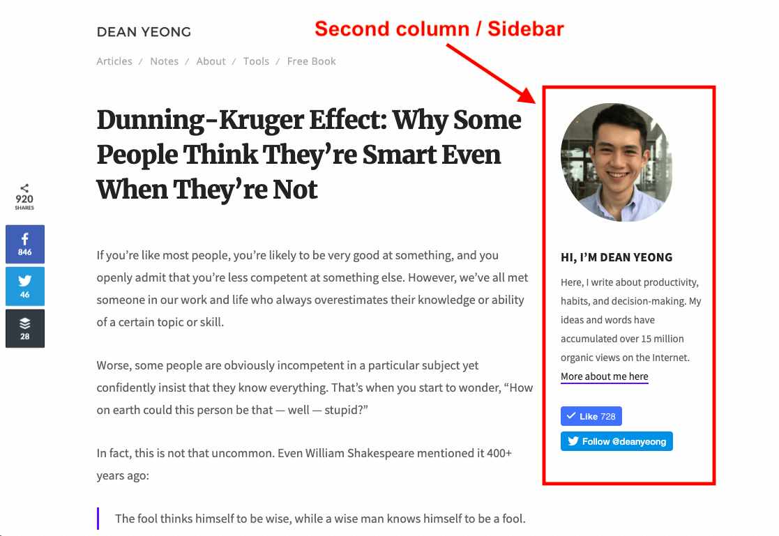
But there are times when you want to use a multicolumn layout, mainly as a sidebar that doesn't take away from your main content.[*]
A sidebar provides additional space for:
Introducing the author of the blog post.
Adding an email opt-in form.
Promoting related blog posts.
What if you want to make your blog as neat as possible, but include a sidebar for marketing purposes?
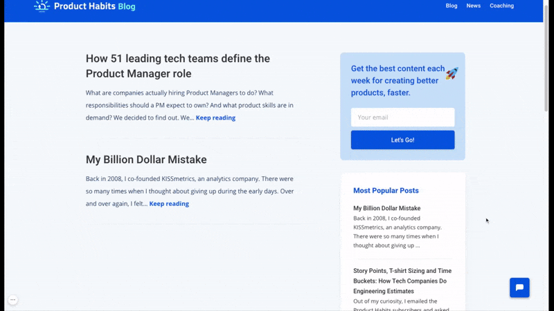
Here’s an example of how Product Habits uses the two-column layout in the blog list page where readers are browsing instead of reading and single-column layout for the blog posts to keep readers' focus on the content.
The blog uses the two-column layout to showcase the list of blog posts with a sidebar for an email opt-in form and the three most popular posts. A single-column layout is used for blog posts to improve readability.
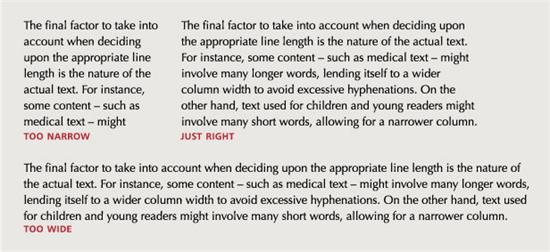
When you read a book, newspaper, or article on your desktop screen, you move your eyes from left to the right again and again, and it gets harder for your eyes to follow the line when it gets too long.
You might even want to turn your head from side to side just to read it. Here’s an example for how it looks to have different numbers of characters in a line:[*]
To make sure this doesn’t happen to your readers, limit the number of words and characters per line for your blog posts.
Here’s the rule of thumb you can follow for materials on the web:
Anything from 45 to 75 characters is commonly seen as a satisfactory length of line for a single-column page set in a serif text face in a text size. The 66-character line (counting letters and spaces) is widely regarded as ideal. For multiple column work, a better average is 40 to 50 characters.[*][*]
There are two ways to optimize the characters per line:
Adjust the width of the column. If you have too many characters in a line, narrow down the column, and vice versa.
Adjust the font size. If you want to keep the column width to fully use the available screen, you can choose to use a large font size for your text.
You don’t need to be a graphic designer to know how to use colors to make your blog posts easy to read.
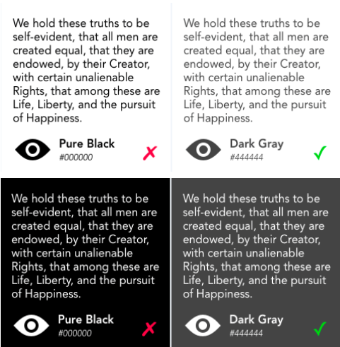
Depending on your brand colors, you can use different colors for your website background. The rule of thumb is to have the text color in contrast with the background, so they are readable.
If the background is white, use black for the text. On the flip side, use white text (or any light colors) when the background is black or dark.
But remember, never use pure black for your background or text.
Pure white has 100% color brightness and pure black has 0% color brightness. The contrast between them is proven to lead to eye strain for the readers.[*]
Here’s an example:[*]
Instead of using pure black, use dark gray for your text or background, especially for paragraph text because readers spend more time on them compared to the headers.[*]
There hundreds and thousands of fonts out on the Internet and you probably don’t know every one of them. Me either.
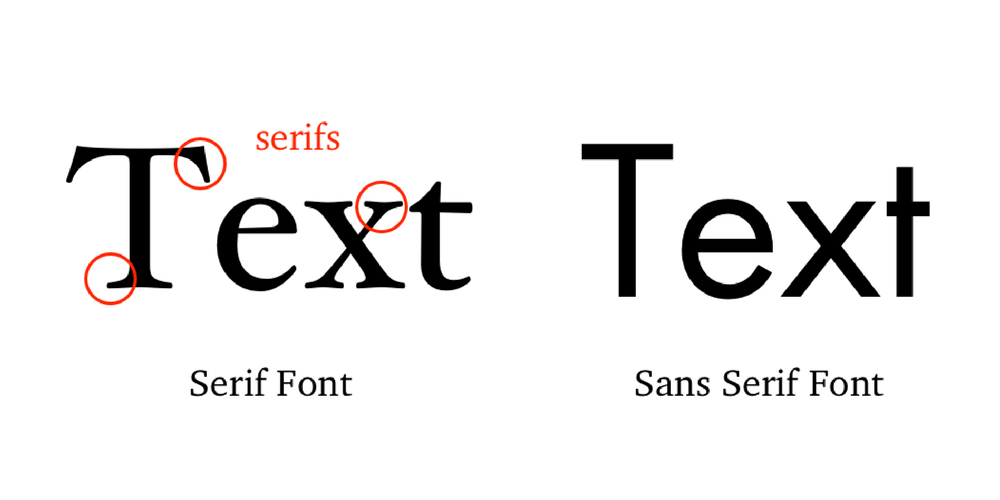
However, most fonts come down to two categories: serif and sans serif.
In the early days of computers, serif was generally for print, and sans serif was for monitors, since the monitor resolution was poor and made the serifs look fuzzy and it affected readability.
Serif fonts also have a longer history compared to sans serif, and are commonly used on mediums with lengthy text like books and newspapers. Because of that, you can use serif fonts if you want to portray a more serious, professional image.
On the other hand, sans serif fonts are the modern typefaces that are easily recognizable and read. These fonts are widely used by people who prefer a more modern design approach.
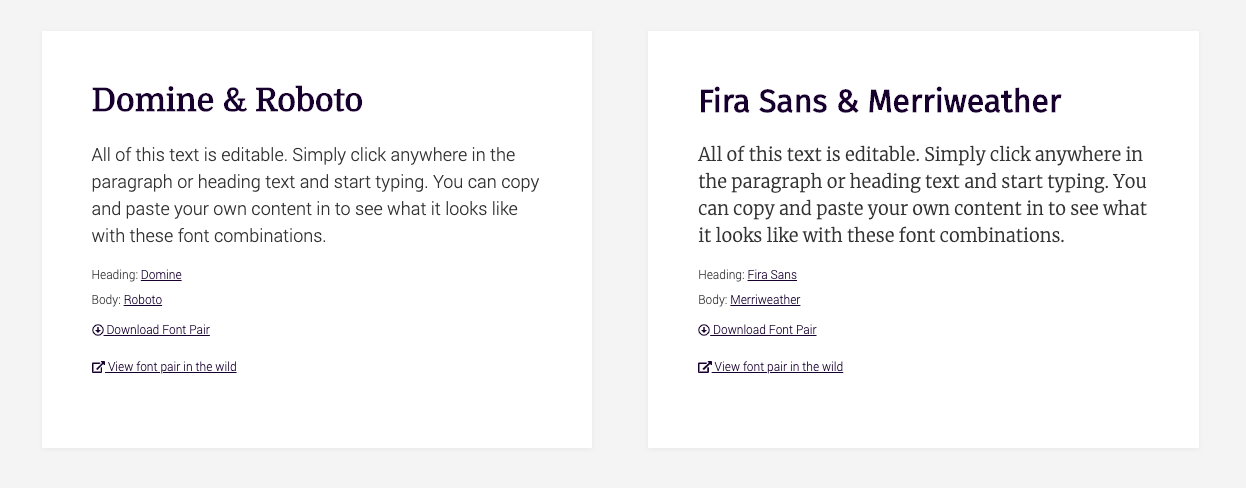
For the numbers of fonts in your blog, try keeping it at fewer than three fonts (I would highly recommend you use only one to two fonts).
You can use a site called FontPair to find the perfect font pair for your site:[*]
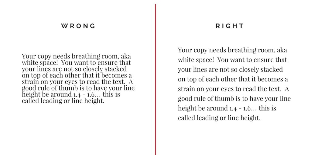
Here’s an example of the bad and good use of line height:[*]
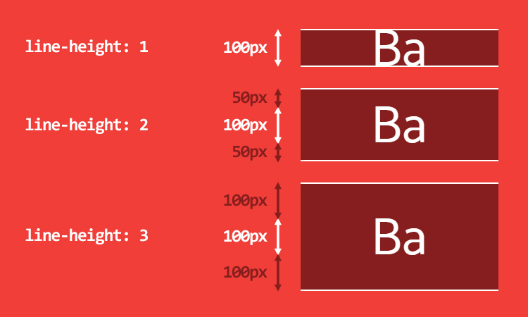
CSS can be used to set the line height to control vertical spacing between lines of text. The image below shows how it works.[*]
Instead of getting into the details, here’s a quick formula you can follow:
For normal paragraph text, use line height from 1.4 to 1.6.
For text with large font sizes like the headers, use smaller line height from 1 to 1.2.
It’s hard to edit the line height without basic coding skills. But learning about it helps you make a more informed decision when choosing the right theme for your blog.
It’s clear that more and more people are using their mobile devices for content consumption, so it’s crucial to use a responsive blog layout that can adapt to the device being used.
With a responsive layout, your blog will look good on any device. It will rearrange and resize all the formatting and elements, including images and multicolumn sidebars, to be optimized for mobile.
If you’re using a decent WordPress or Shopify theme, your theme is likely to be responsive.
If you’re just getting started or not sure you have the right theme and layout, check out the list of my most recommended WordPress and Shopify themes for blogs.
Discover The Best WordPress And Shopify Themes For Blogs
Now you’re done with the blog layout; it’s time to get into the actual content formatting, including how to use subheaders correctly to how to add call to action (CTA) items into your blog post.
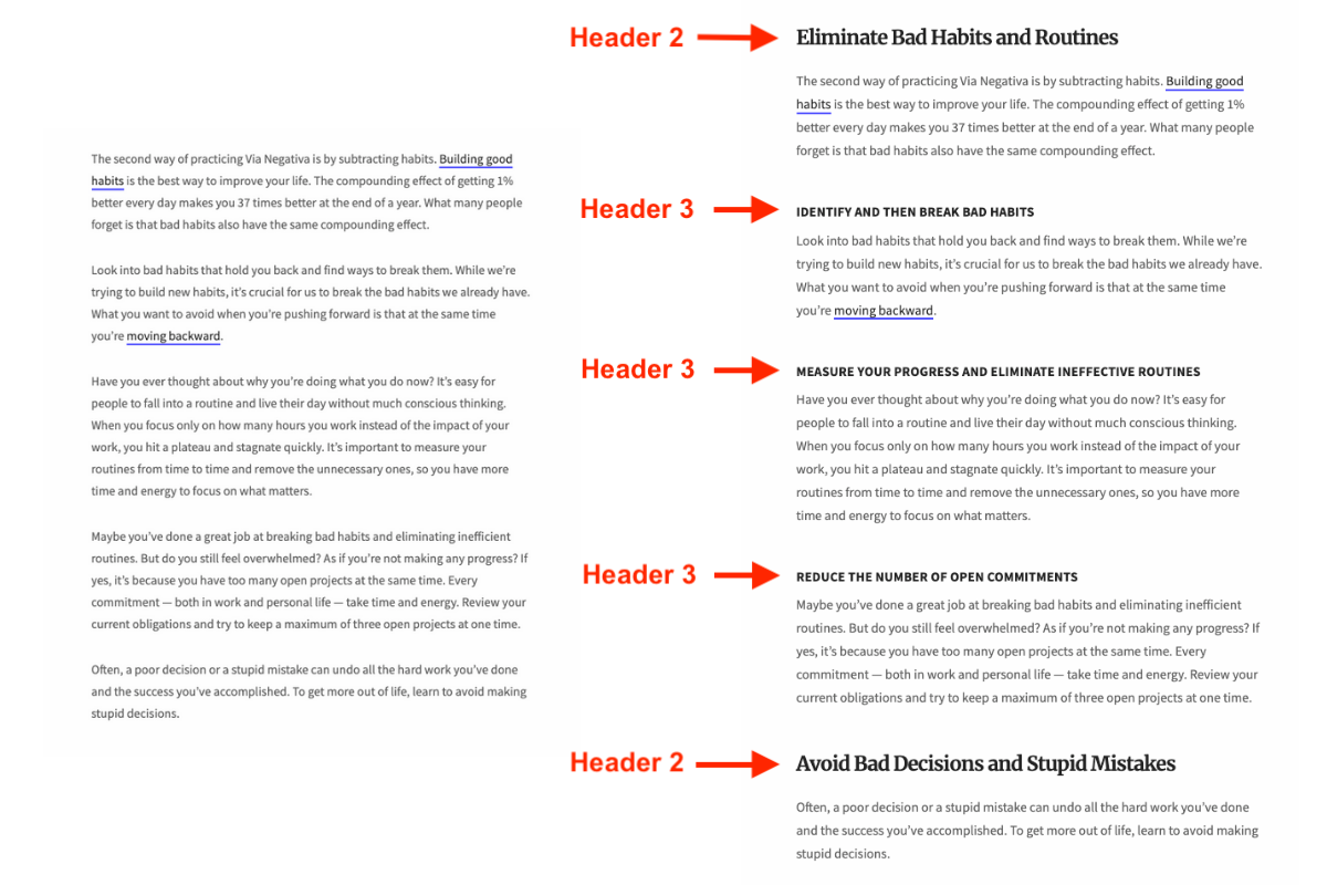
It’s essential to break up your content using subheaders.
It makes it so much easier for your readers to read — or skim — your blog post. Just look at this same piece of content with and without subheaders.[*]
Aside from improving the readability for your readers, this helps search bots understand the structure of the page.[*]
You don’t need a bunch of headings for your blog posts. It’s enough to stick to a few basic ones:
Header 1 or Title. Usually the largest font size, use it for the blog post title.
Header 2. One of the most important subheaders that breaks the content into sections.
Header 3. Subheaders within each section of Header 2.
In most cases, all you need are the three headers and subheaders above. Unless you’re writing a long blog post that needs extra layers of subheaders, there is no need to have Header 4 and beyond.
A long paragraph makes it looks like you have a lot to say. Except, no one is actually reading it.
You’re writing a blog post, not a research paper.
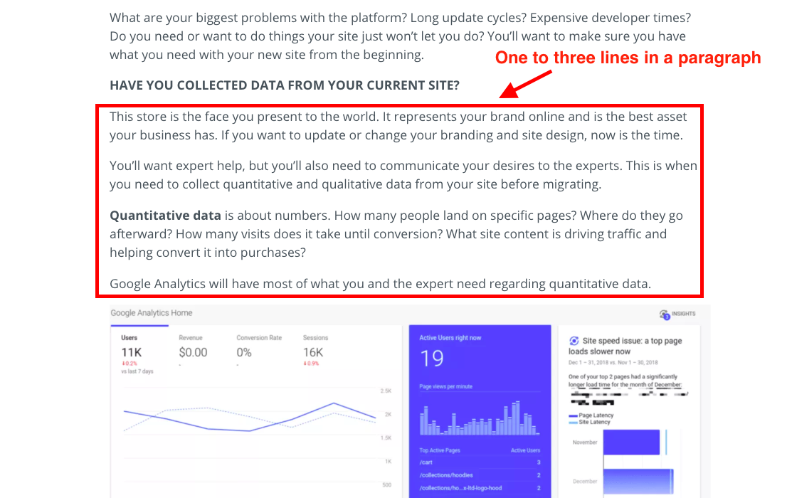
Limit the words per line and break your content up with subheaders. Keeping your paragraphs short with one to three sentences makes it easy to read.
It could be hard if you’re used to writing in long paragraphs, but try your best to keep your blog post to one to three sentences per paragraph.
In tip #7, I suggested you only stick to Header 2 and Header 3 for your subheadings. Having more, multilayer subheaders makes the blog post looks messy and confusing.
But what if you genuinely want to make a key point in a paragraph stand out?
It’s time to get bold.
You can use bold text in between sentences to grab readers’ attention.
Using bold text for an entire paragraph is overkill. The paragraph will look like an infected block of text that doesn’t seem to fit into the entire blog post.
Yes, your readers will definitely see it, but I doubt they will actually read it.
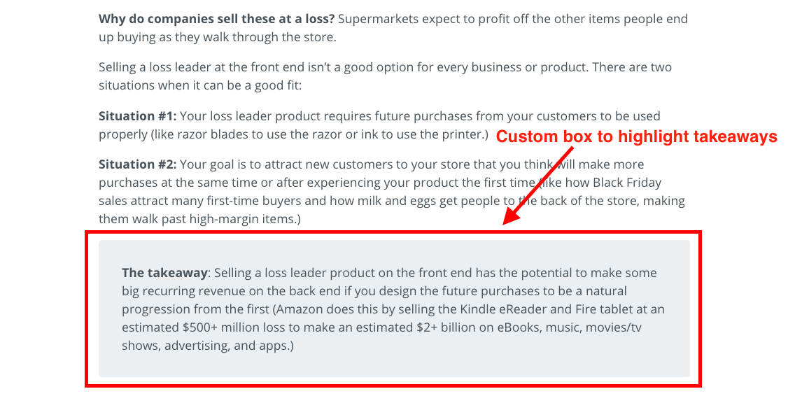
In these cases, you can use custom styling to highlight one or more paragraphs. Here’s an example of how we highlight key takeaways in Sumo blog posts:
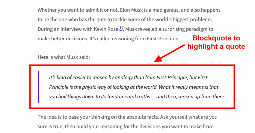
Another example is to use a blockquote to highlight a quote you want your readers to pay extra attention to.[*]
Now you’ve gone through the first 10 tips to create a better blog post format. Here’s a recap:
Use a single-column or two-column layout.
Limit the number of characters per line (66 characters per line is ideal).
Use easy-to-read colors for text and background (gray text on white background).
Select the right fonts for your blog (using the FontPair site).
Keep an eye on the text line height (1.4-1.6 is best).
Use responsive web design.
Break your blog post down into sections using subheaders.
Use short paragraphs (one to three sentences).
Bold key sentences to make them stand out.
Add custom styling to highlight your content.
See what I did there?
Most people don’t read; they skim. It’s likely you skimmed this post and got here, only to find you’ve missed one or two of the above going through the list.
Lists are easier to read and digest compared to paragraphs. So make sure you use them in your blog posts whenever possible:
Ordered list (numbers). Use this for list items that require numbers to make sense, such as step-by-step instructions.
Unordered list (bullet points). Use this to make a list of items within a specific group or topic where the order doesn’t matter.
There are times when your message is best delivered as an image or illustration rather than words. Images are also generally more attention-grabbing than a large block of text.
Here are a few key tips to keep in mind when adding images to your blog posts:
Use high-quality images. A blurry image doesn’t make the cut if you want to be seen as an expert in your industry.
Adjust the image size. Make sure your images don’t take up too much of the screen, while still being large enough to convey their meaning.
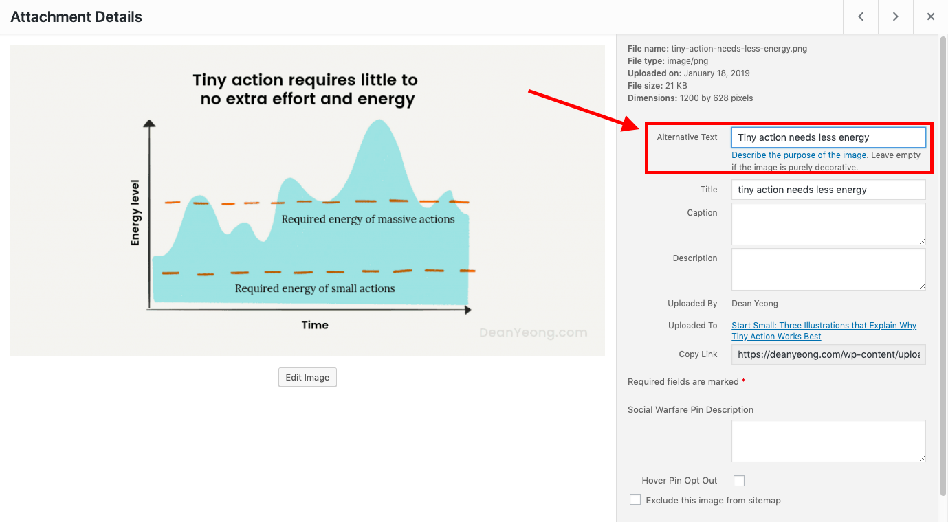
Add an alternative text (alt text) to images. The alt text helps search engines make sense of the images. Describe the images in the alt text field to help your images and blog posts rank.[*][*][*]
OK. It’s likely you don’t have a blog as a hobby. You run a blog to grow your business. Which means your blog needs to convert visitors— whether it’s to email opt-ins or sales.
Part of the conversion game is your copy, which includes your headline, your offer, and benefits.
Another part of it is how you format these conversion elements in your blog posts. Here are tips on how to do them right:
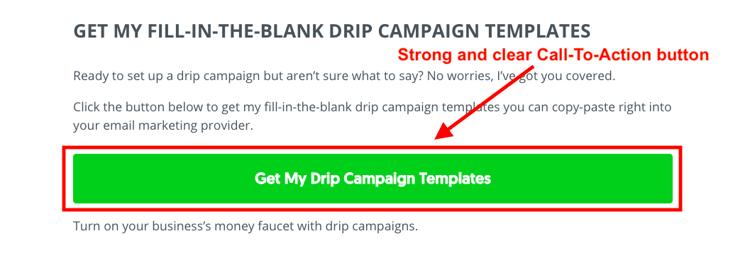
Match your CTA formatting (colors, fonts, images) with your website and blog posts.
Place the CTAs at high-converting areas, like the above-the-fold section, sticky sidebar, and at the end of the blog post.
Make sure your CTAs are strong and clear to grab attention and encourage action.
It’s challenging to get everything on point at once. Often, there are constraints in how you can customize the CTAs based on the themes you use and your development skills.
An easy way is to use Sumo because you can add email pop-ups, smart bars, and links that trigger email opt-in forms to open on top of your blog posts — without the need of any coding skills.
Also, you can design these CTAs to match your brand within Sumo using our drag-and-drop form builder.
There’s a lot to do when comes to creating the right blog post format.
To help you get started FAST, I’ve made a list of the best (WordPress and Shopify) themes for your blog.
All the themes are responsive and built with design best practices to make your blog look great and engaging.
Click the button below and transform your blog post format with the best themes available.


Comments